

ATLAS: Move Beyond
Click image to view in fill screen
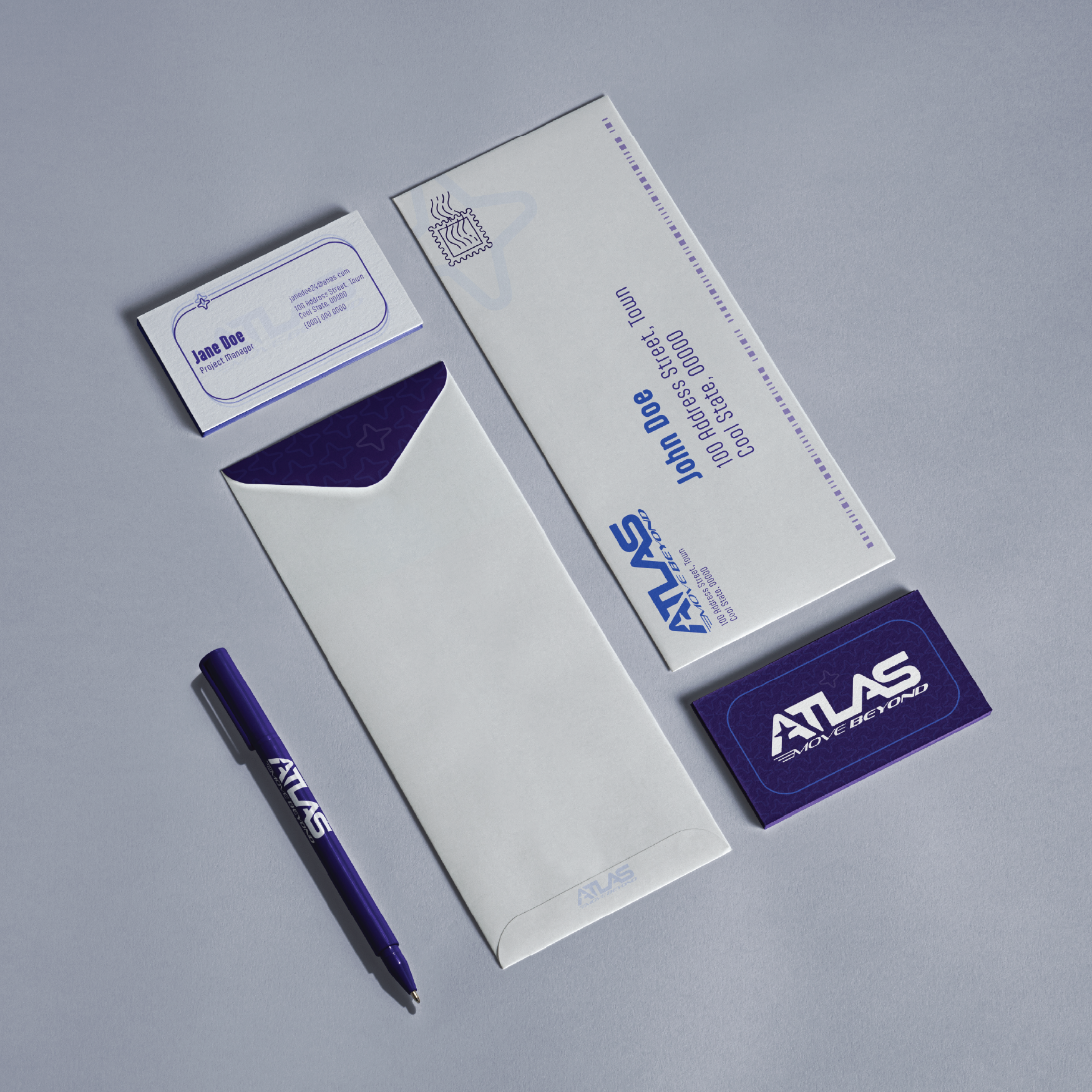
ATLAS:Move Beyond is a vehicle and automotive parts manufacturer, dedicated to making the automotive world more eco-friendly and accessible, with a strong commitment to sustainability and affordability in mind.
ATLAS is a brand identity I developed at Montserrat in which we were assigned to reimagine an already established brand. I chose to reimagine the car brand Subaru but since I already like the company so much, I decided to add a small twist and some new branding.
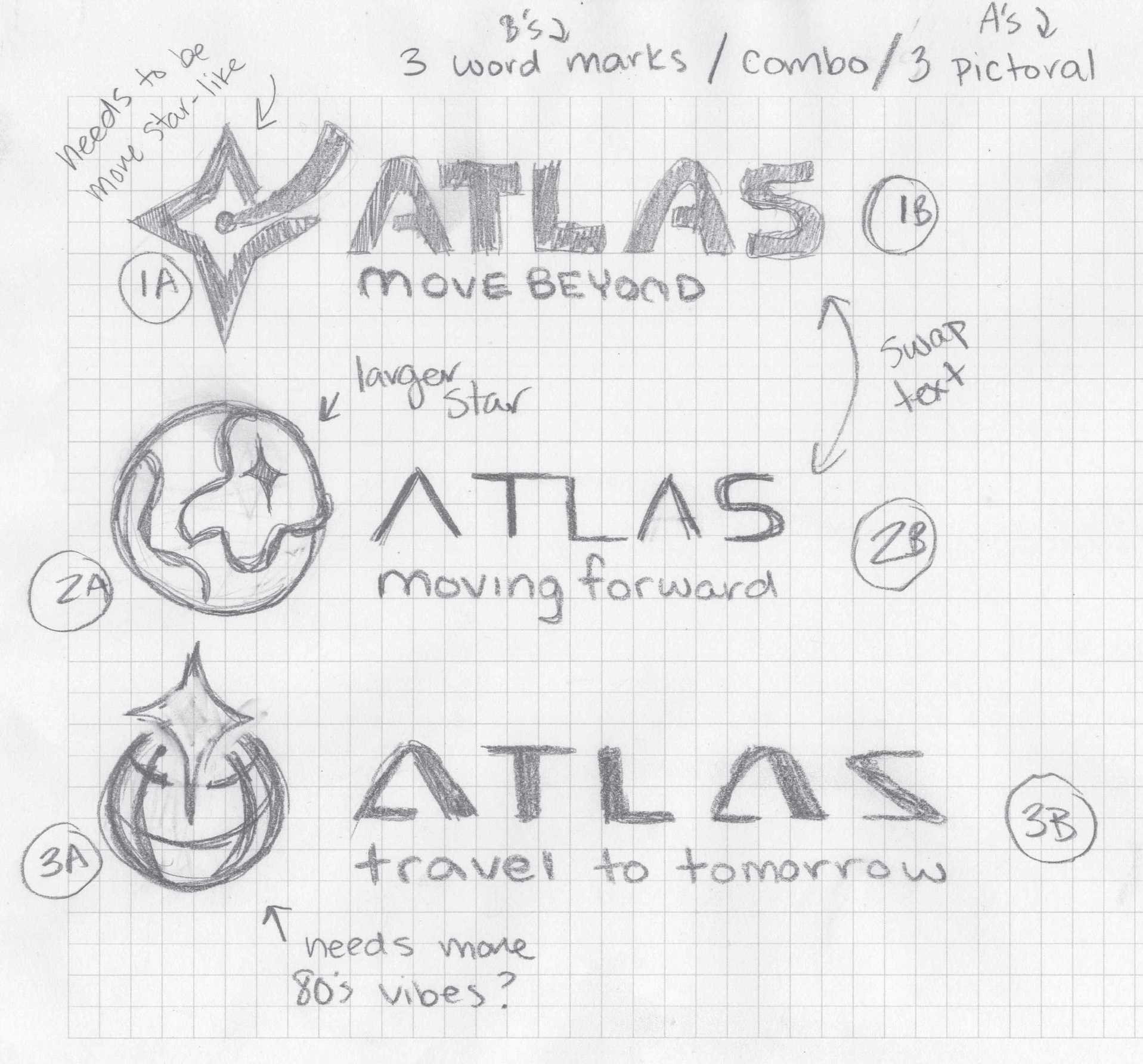
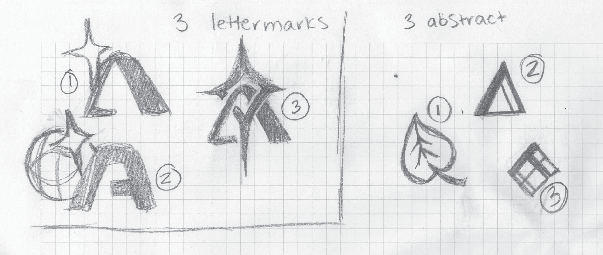
ATLAS logo sketches
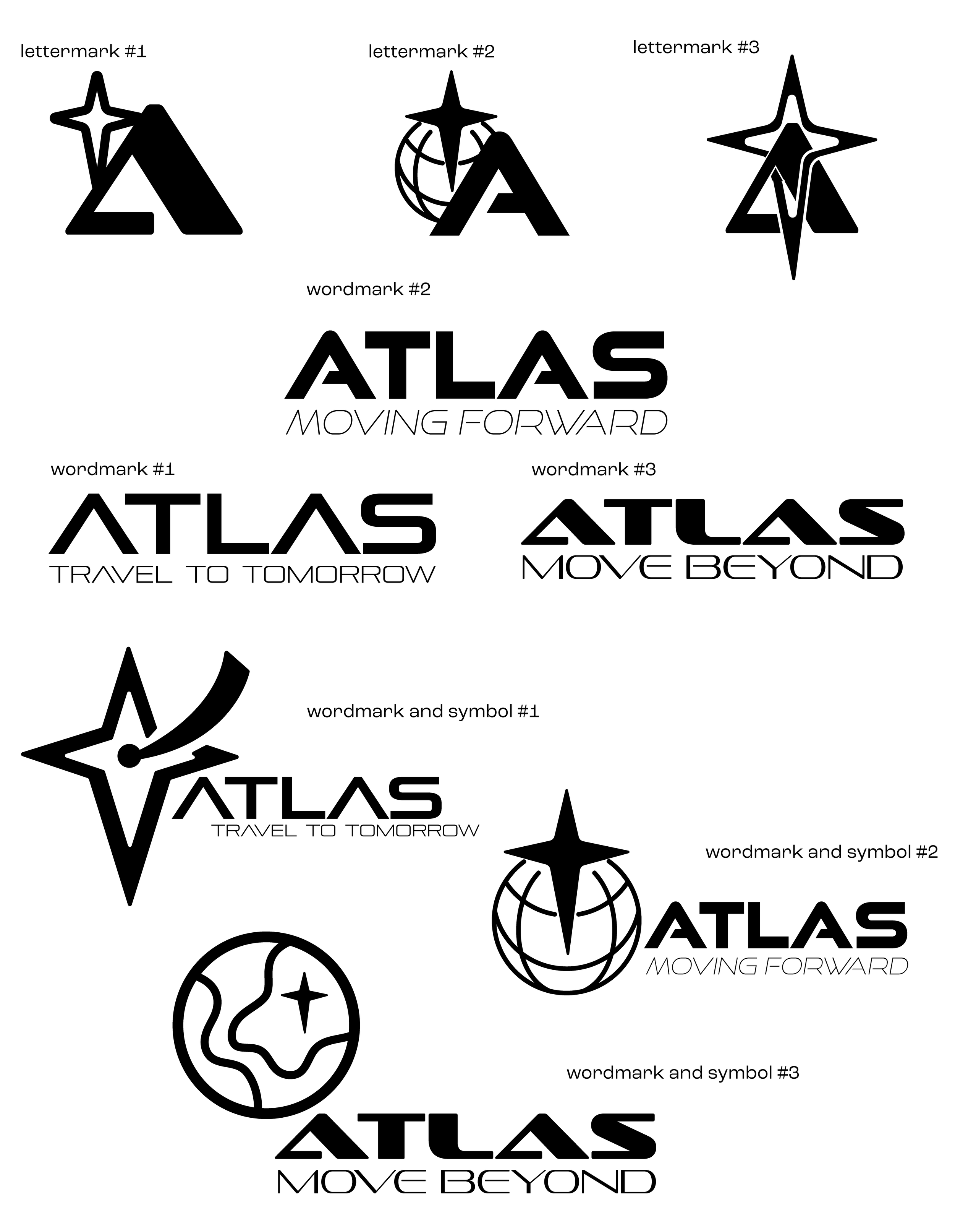
ATLAS logo experimentation
I carefully designed ATLAS, from the logo to color choices. The logo underwent several revisions before I found one that represented ATLAS well. I aimed for a design that illustrated the peak concept associated with an atlas. The final logo is simple yet effective, featuring the name and a star in the center of the “A.”
I created taglines to convey a futuristic vision and dynamic movement, central to the logo. I chose “move beyond” to reflect ATLAS's forward-thinking spirit.

Final ATLAS Logo
Next, I needed to decide on the color palette for the project. Since ATLAS has a strong name, I felt it was important to choose colors that matched that strength. I initially thought about using a shade of blue, which seemed like a good start. I looked through the Pantone colors to find the right blue that captured what I wanted. Familiar with the Pantone book, I knew it was the best resource for color choices.
I aimed to find a blue that was eye-catching and conveyed eco-friendliness and affordability.

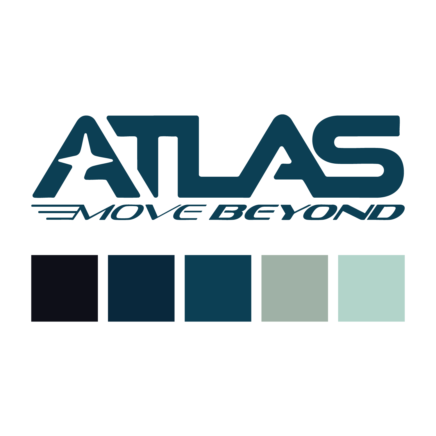
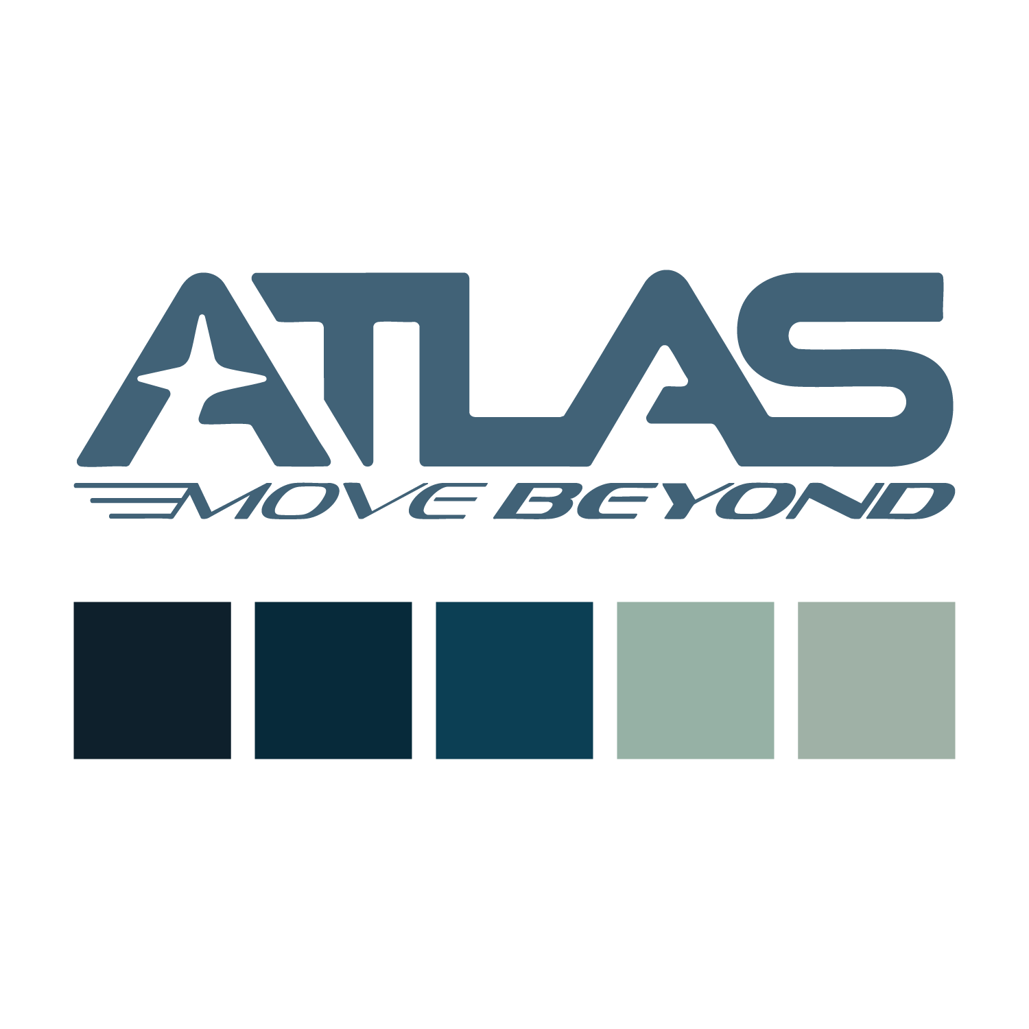
ATLAS color mockups
The project ended with designing the stationery for ATLAS. My teacher brought in a professional from a paper company to teach us about choosing and designing paper. One paper sample had a stunning print on it, with a deep color on the back that matched the front and the logo. I loved this idea and wanted to use it in my design.
I also thought each item needed a pattern for a unified look, so I created a star pattern to go along with the star in the logo's "A". Additionally, I designed a small box for bolts that reflected the brand's overall idea. After choosing the pattern and colors, the stationery came together beautifully.
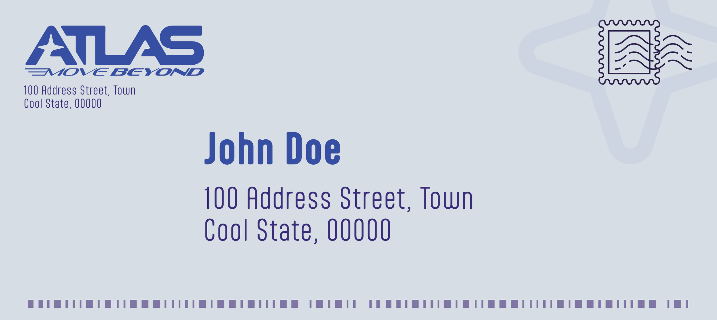

Envelope designs
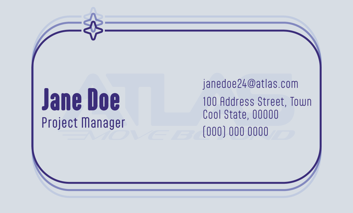
Business card designs
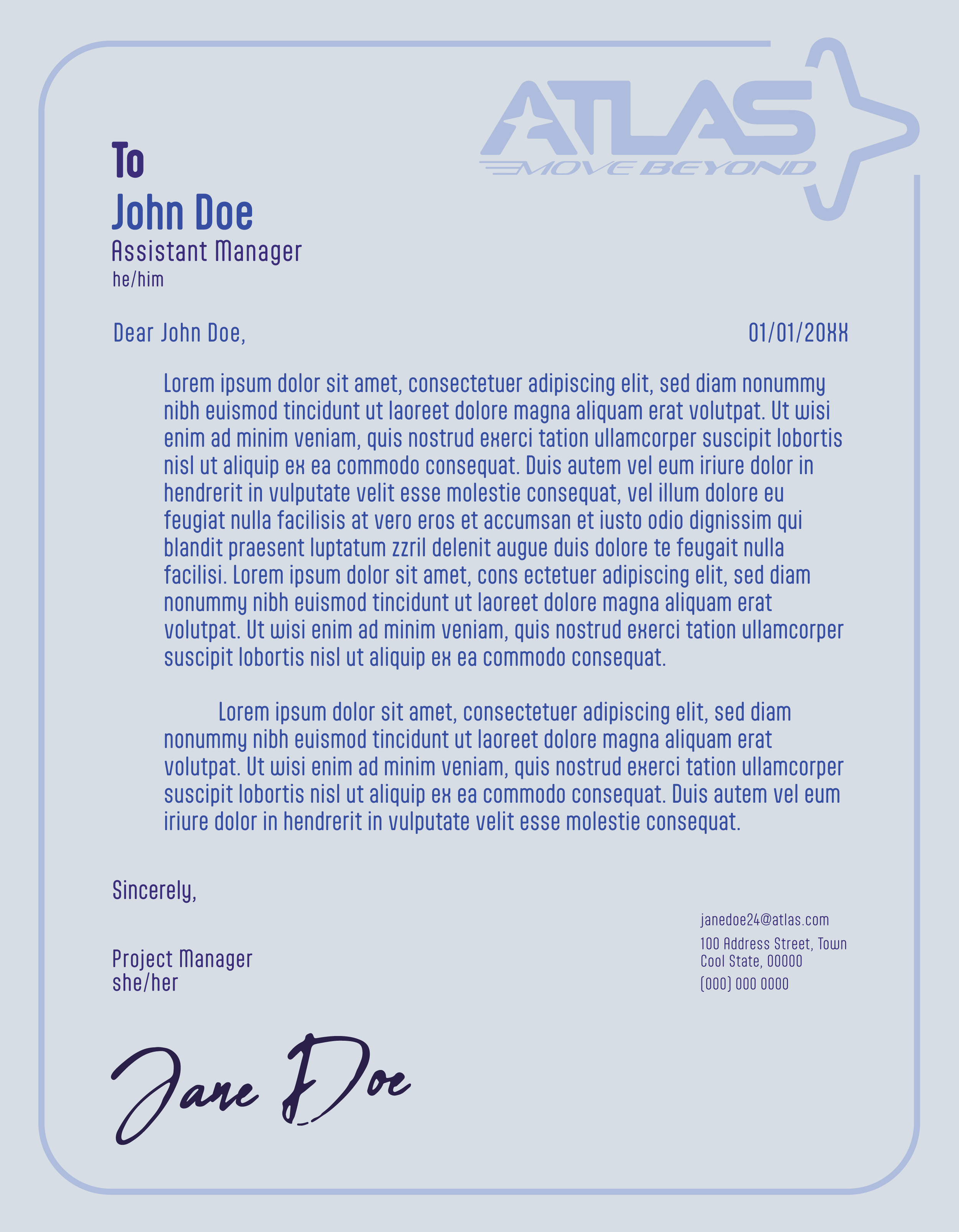

Letterhead designs
Additionally, I got to experience the software Figma for the first time through this project. I needed to create a mockup of an application associated with our company so I decided to create the “ATLAS: Help and Repair” app. In it, you can add your cars information to get tips and assistance with your specific vehicle. You can also search for local stores and autocare locations that are nearby.
At the time, I had never used Figma before and was honestly somewhat intimidated by it. However, as I started to use it, I realized how similar it is to other applications I know well, like Photoshop or AfterEffects.
Now that this project is completed, Im so happy with how it came out and it has inspired me to want to creat emore. It also has helped me learn more about my design process and what Id want to do for a career.